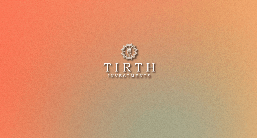
Our emblematic logo is a sophisticated expression of legacy and trust. At its center, the ornate crest—featuring a crowned shield with the letter “T”—represents heritage, protection, and leadership. The intricate circular frame surrounding the crest draws inspiration from classical architecture and royal insignia, reinforcing a sense of prestige and permanence. This refined composition, paired with elegant serif typography, reflects the values of discretion, integrity, and timeless growth. It communicates our commitment to enduring excellence, tailored wealth strategies, and a tradition of investing with purpose.
Clear Space
To preserve the elegance and clarity of the Tirth Investments logo, it must always be surrounded by adequate clear space. The minimum margin is defined by the twice the height of the letters “INVESTMENTS”. This spacing ensures the logo remains distinguished and unobstructed in any context.
Identity
Our logo embodies legacy, trust, and excellence. Its intricate crest and serif typography are designed to signal heritage and financial stability. To ensure it always stands out, logo usage adapts by scale and background — maintaining a consistent and dignified presence across formal and digital media.
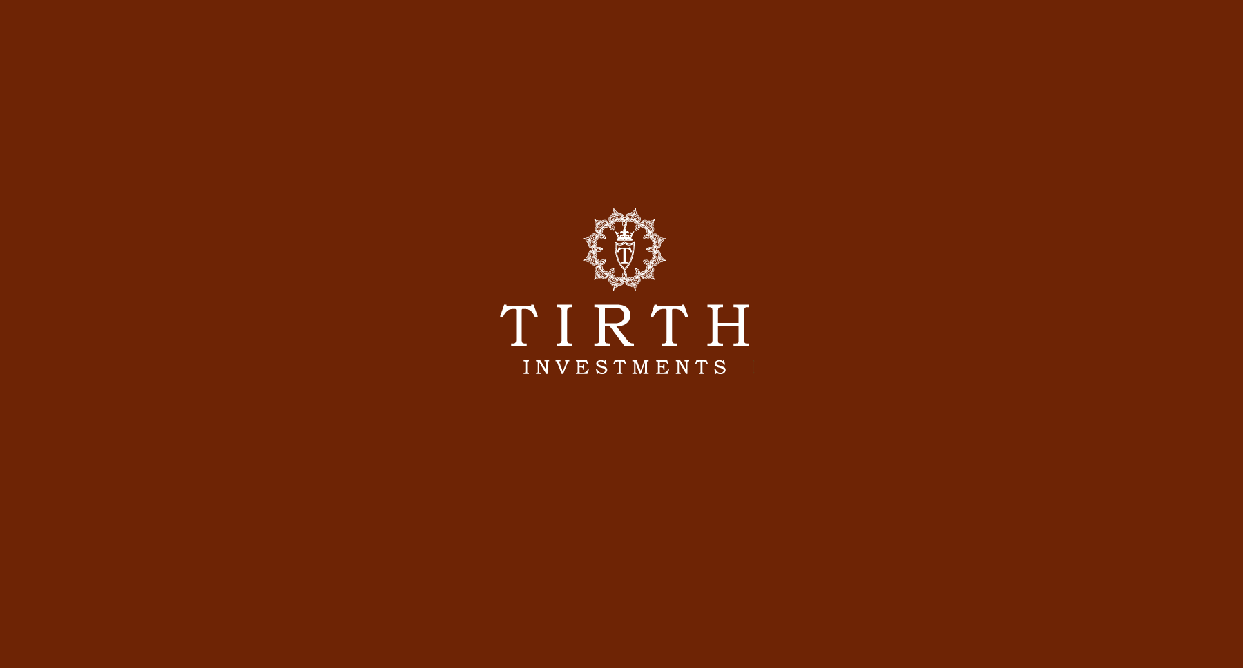
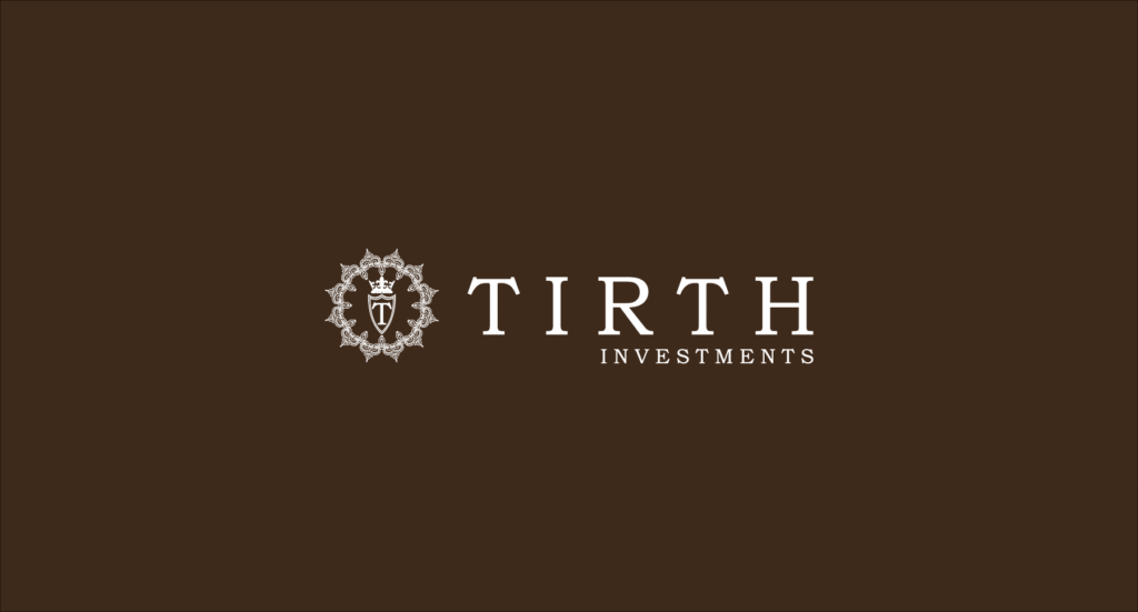
Dark, saturated backgrounds like Chestnut Brown are used with larger logo sizes to project luxury and authority — ideal for high-end stationery or formal reports.
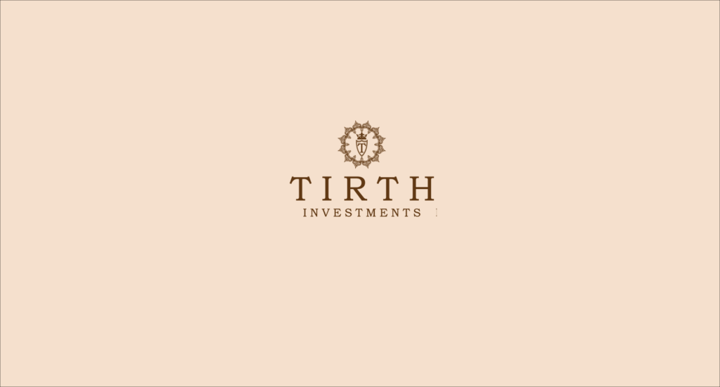
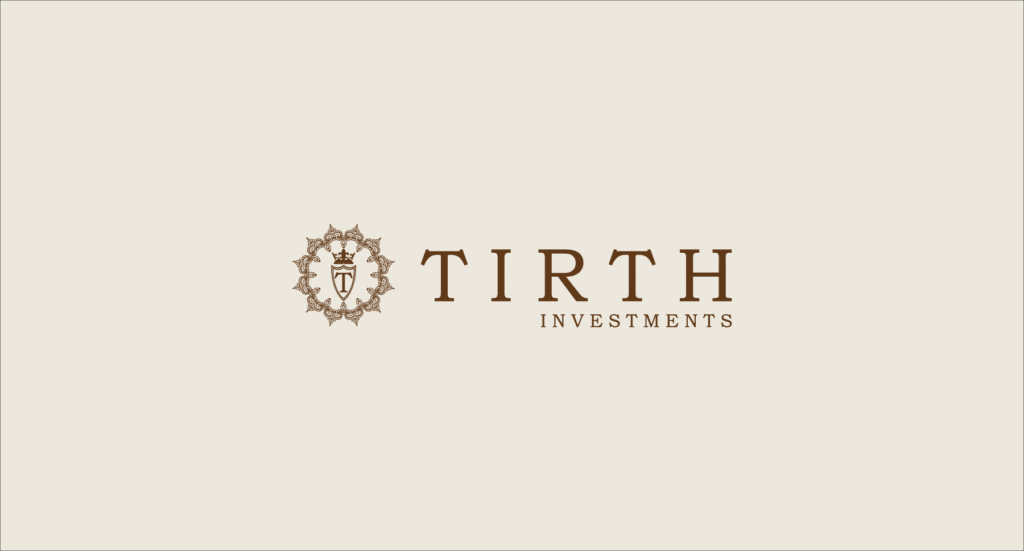
Light neutral backgrounds, like parchment or ivory, complement the ornate logo details at smaller sizes — perfect for minimal print layouts or embossed business cards.
Misuse
These are examples of misuses of the symbols.
Do not warp or distort the logo in any way.
Do not rotate the logo.
Never use drop shadow or any other effects.
Never change the color other then the dark and light colors specified.
Do not change the transparency of the logo.
Do not fill the image with an image, pattern or gradient.
TIRTH INVESTMENTS Typeface
PRIMARY TYPEFACE
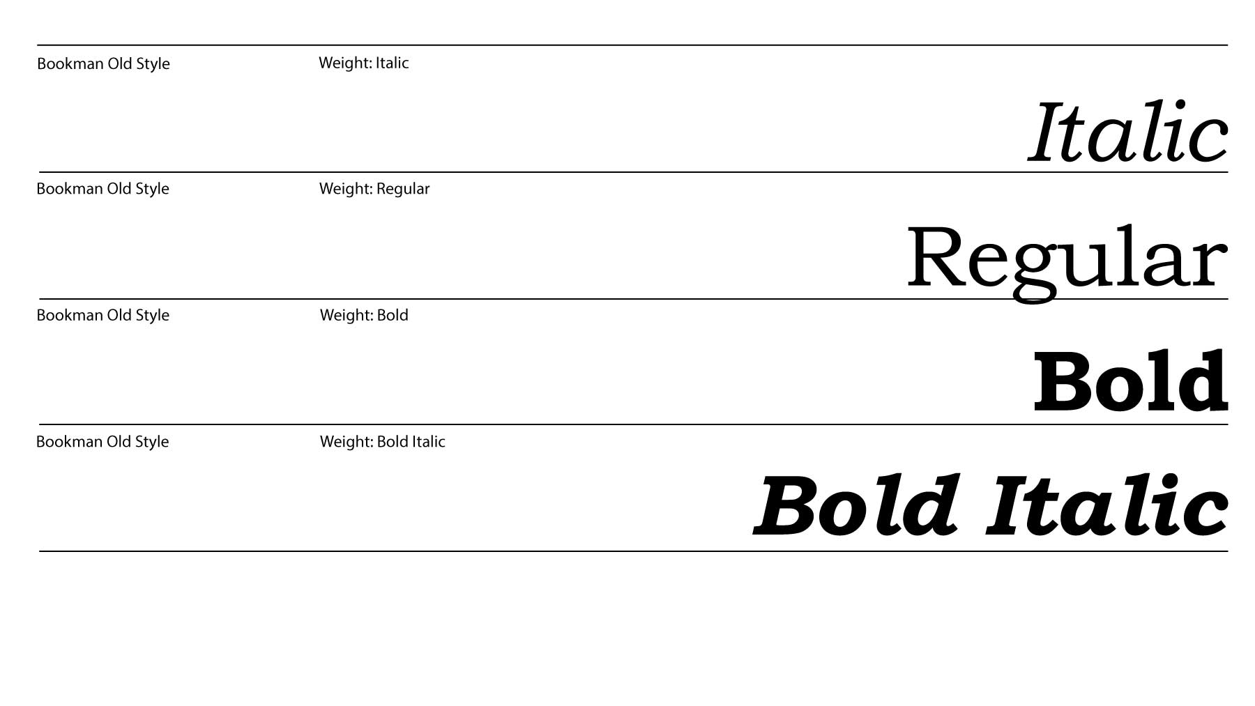
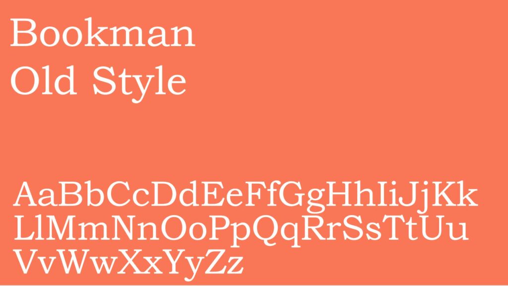
Our primary typeface is Bookman Old Style, a refined serif font that evokes tradition, precision, and trust. Its high-contrast letterforms and classical proportions perfectly complement our emblem and reinforce our heritage-driven identity.
SECONDARY TYPEFACE
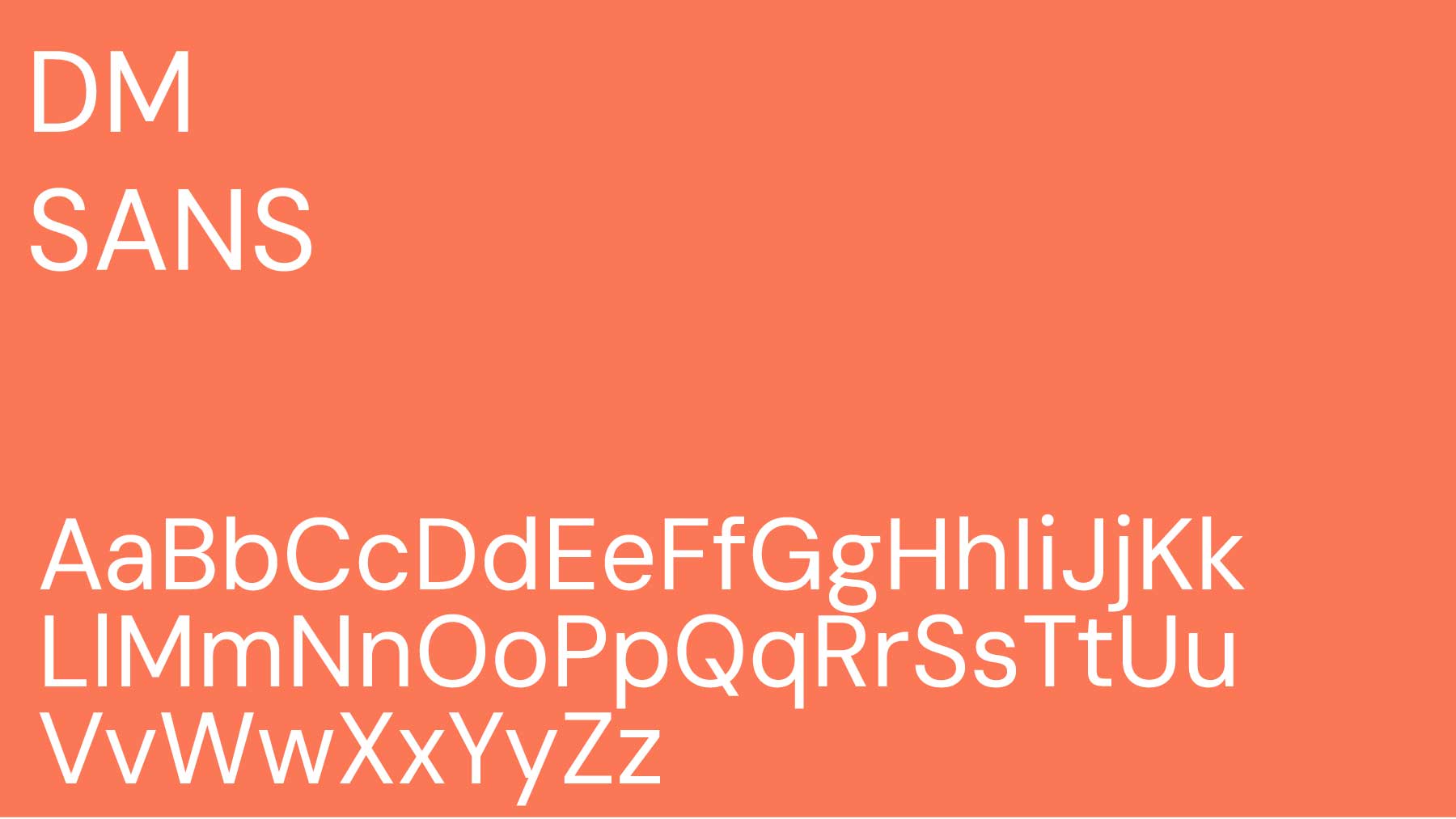
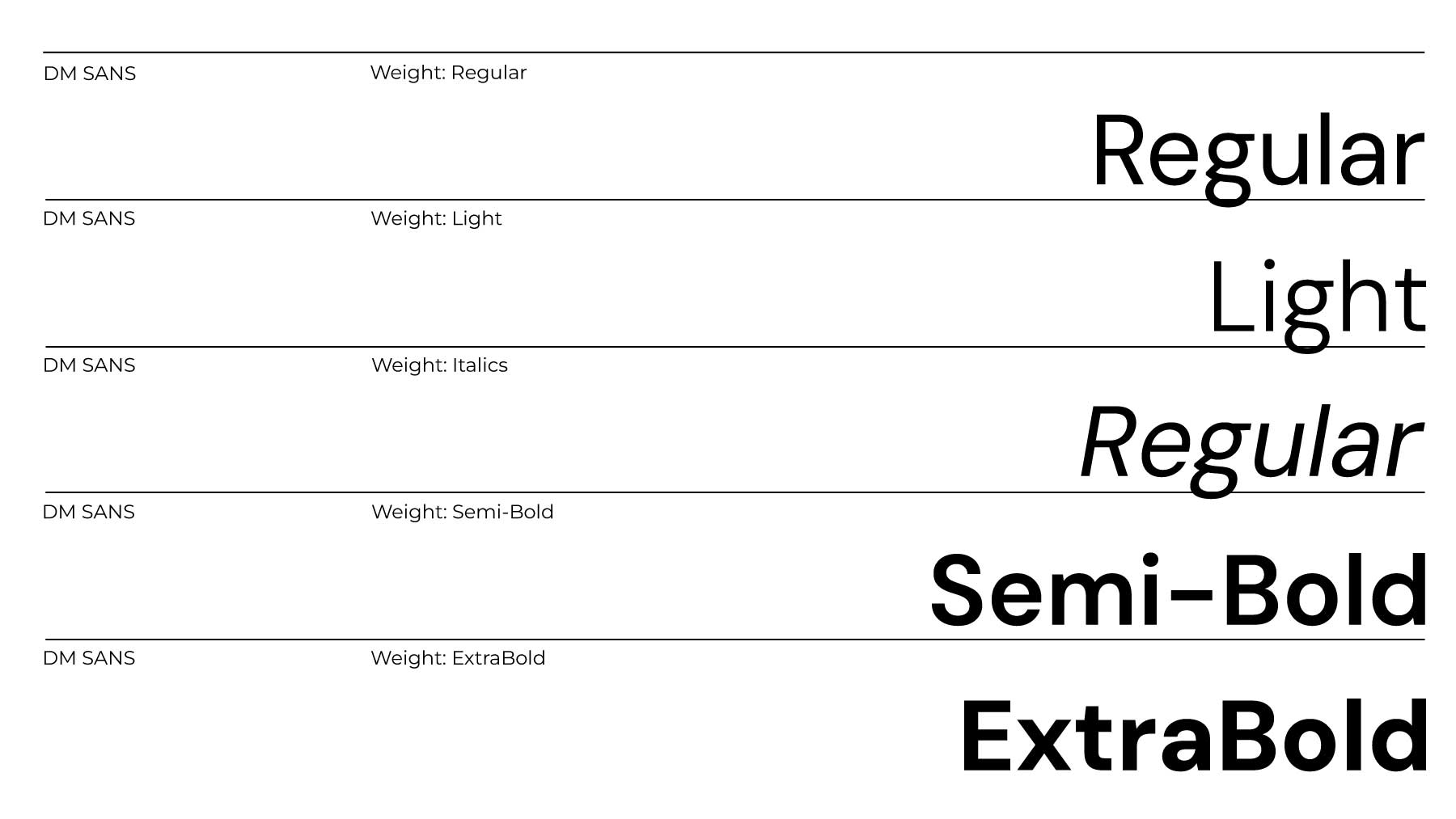
Our secondary typeface is DM Sans, a modern sans-serif that pairs cleanly with our primary font. It’s ideal for subheadings, labels, digital interfaces, and financial disclosures—bringing clarity and accessibility to formal layouts.
HIERARCHY
We use Cormorant Garamond Bold for main headlines and impactful statements, maintaining a stately tone. Cormorant Garamond Regular is used for body copy to ensure readability and elegance. For technical details, charts, or navigation elements, we rely on DM Sans for its simplicity and clarity in digital spaces.
Core Brand Palette
Our primary brand color is Regal Brown (#623E20), inspired by heritage, trust, and timeless refinement. When paired with our elegant neutrals and subtle metallics, it reflects the enduring values and sophistication central to the Tirth Investments identity.
COLOR VARIATIONS
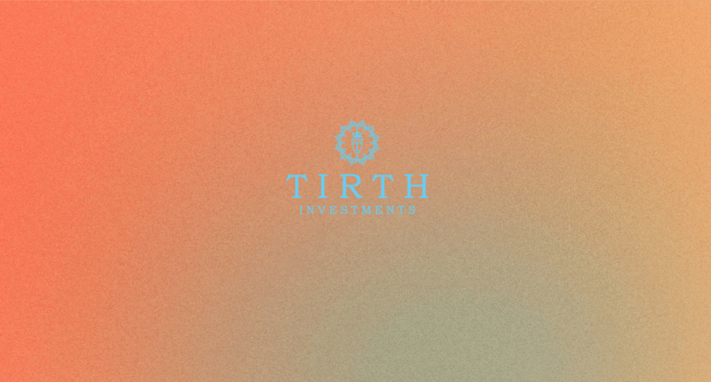
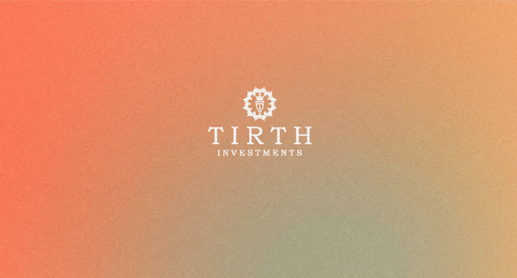
Our logo is designed to adapt with grace and contrast, ensuring it maintains its prestige and clarity across various applications. It is primarily used in Regal Brown or White, depending on the background.
Regal Brown (#653F19) is our core brand color and is ideal for light or neutral backgrounds. It reinforces the classic, luxurious tone of our identity.
White is used when the logo appears on rich or dark backgrounds, offering a clean, distinguished presence while preserving legibility.