The Logo

Our logo is the bold expression of the Schnitzer Shock Absorbers brand. The striking geometric lettering, outlined type, and aggressive red/black contrast communicate performance, strength, and precision engineering. The boxed framing around the core name enhances focus and impact—mirroring the engineered precision that defines our shock absorbers.

Clear Space

To ensure clarity and visual balance, the Schnitzer logo must always be surrounded by a minimum margin of clear space. This space is determined using the height of the lower text as a reference unit (✖). A margin equal to ✖ is maintained on all sides to prevent visual clutter and protect the integrity of the logo across all placements.

Identity

Our logo is always displayed in its full-color form to emphasize strength, impact, and a bold engineering presence. To preserve clarity and maximum visual effectiveness, the logo is carefully scaled and placed against backgrounds that enhance its form. Whether used on performance parts or promotional assets, our identity remains consistently powerful and unmistakable.

 Bold backgrounds like Asphalt Black or Performance Red are paired with larger logo sizes to create maximum visibility. Seen here on a service van, the logo makes a strong, mobile brand statement that stands out on the road.

 Lighter backgrounds like Cotton Gray or Industrial Navy are used with smaller logo sizes for functional, durable apparel. Seen here on the back of a mechanic’s worksuit, the logo reinforces brand identity in real working environments without compromising visibility or professionalism.

Misuse

These are examples of misuses of the symbols.

Do not warp or distort the logo in any way.

Do not rotate the logo.

Never use drop shadow or any other effects.

Never change the color.

Do not change the transparency of the logo.

Do not fill the image with an image, pattern or gradient.

Schnitzer Shock Absorbers Typeface

PRIMARY TYPEFACE

 Our primary typeface, Spin Cycle, is a bold, industrial-style display font that perfectly matches the engineered feel of the Schnitzer brand. With its squared forms, mechanical rhythm, and solid structure, it reinforces the strength and precision behind every product we deliver. It’s used in both the logo and headline applications to create immediate brand recognition.

SECONDARY TYPEFACE

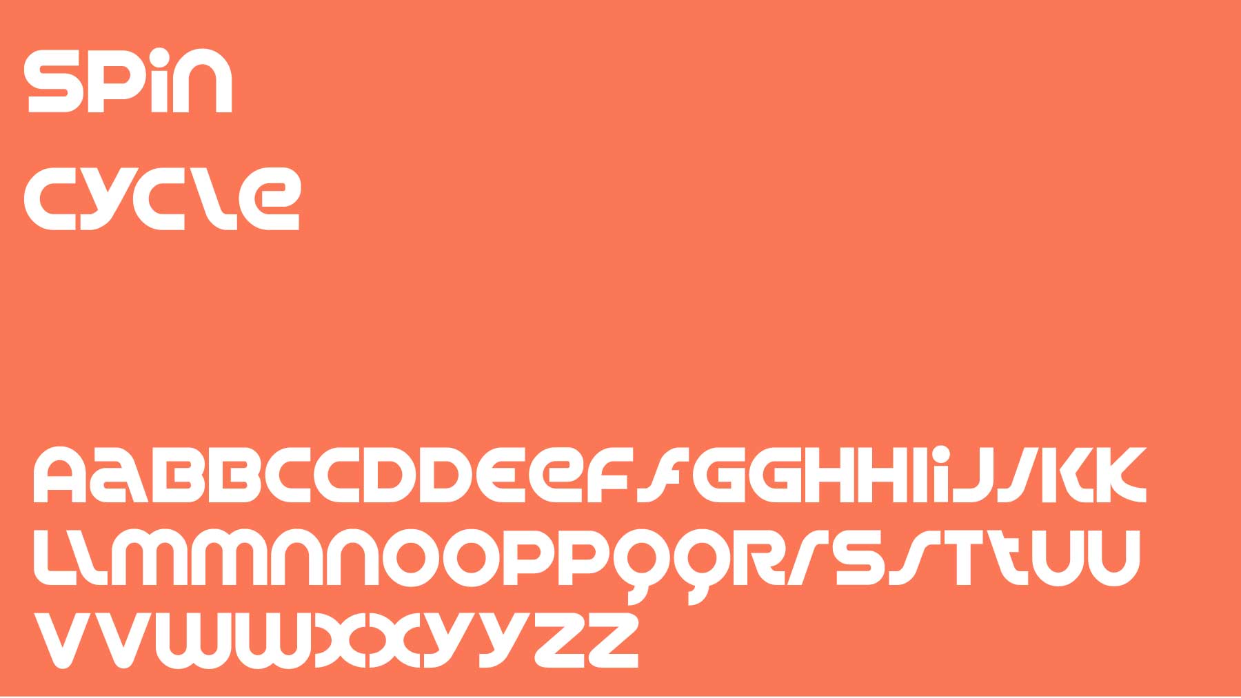
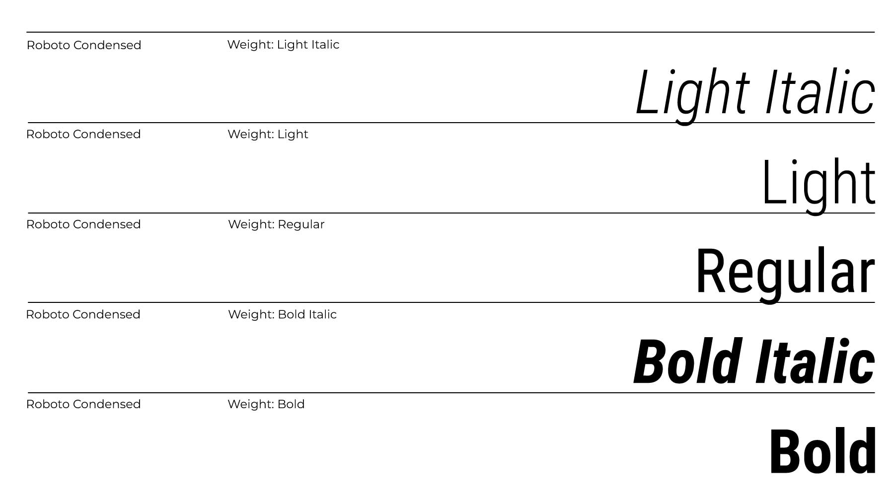
 Our secondary typeface, Roboto Condensed, is a versatile sans-serif font chosen for its legibility and modern feel. It complements the heavy geometry of Spin Cycle by introducing balance and readability, especially in body text, technical specifications, and web content. Its subtle industrial undertone aligns with the rugged, no-nonsense nature of the Schnitzer identity.

HIERARCHY

 We use Spin Cycle Bold for primary headlines and logo treatments to ensure the brand voice remains strong and commanding. For supporting text, Roboto Condensed Regular is used in subheadings, product details, and callouts. This type pairing maintains a clean, technical layout that balances visual power with functional readability.

Core Brand Palette

Our primary brand color is Impact Red, a strong, high-visibility tone that captures the energy, precision, and reliability at the core of the Schnitzer brand. When paired with our supporting palette of asphalt blacks, steel grays, and metallic silvers, it communicates a confident, engineered aesthetic that’s built for performance-driven environments.